The hues chosen for a room’s walls and ceiling can help determine whether your interior design is a hit or miss. Here are a few color psychology tips to keep in mind when planning your home’s color scheme.
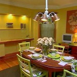
 1. Bright colors — that is, vibrant shades of green and blue, yellow, and orange — provide an expansive feeling. These are friendly, happy colors that encourage communication and are therefore especially welcome in the dining area and kitchen.
2. Dark colors, such as red, purple, blue, and dark shades of green, can have a constricting and gloomy effect. But when applied in the right place or as accent elements, they can help convey comfort and security.
3. Warm colors — orange and yellow hues, for example — raise the perceived temperature of a room. For that reason, they’re best used in rooms that face north. Because they inspire activity, avoid them in rooms meant for relaxation, like the bedroom.
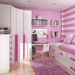
4. Cold colors, such as icy blues and green, have a calming effect. They are especially well-suited for bedrooms; they help you to go to bed relaxed in the evening and wake up refreshed the next morning.
5. Navy blue inhibits people’s willingness to communicate; do not use it in living and dining areas.
6. Red raises the energy level of a room, but it may also make people more irritable and hostile — so it’s not a good choice for a child’s room. Use it as an accent rather than a base room color.
7. Gray should be avoided for the dining area and kitchen — unless you want to dampen your appetite.
Source:


Be sure to choose the color of the interior is correct, so you do not get on your nerves. For example, the kitchen color must be that which increases appetite…)))